Friday, November 27, 2009

Posting From The Sickbed

I have the dreaded H1N1. I'm so bored and sore from laying in bed I decided to get up and do some nails. Forgive my application because I'm shaky-handed.

First we have two Fire Opals from Sally Hanson. My sister had extras so she gave me these. I heard they were hard to find.

Earthen Opal. I really didn't expect to like this at all, but it looks really cool.


It's sort of a reddish-coral. Very bright and notice-me.

It has a grainy, shimmery texture. It's quite sheer, but this is three coats.


I cropped this next one really close because my application was pretty spectacular.

Goldspun Opal. Extremely sheer. This is also three coats.


This has a nice pinky-gold shimmer. I think it would look nice layered, perhaps over a brown or tan? I'll have to give that a try. Maybe even over a gold.

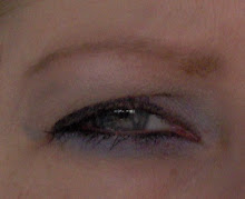
It doesn't flatter my skin tone like this, just plain, and makes my nails look very stained.


I'm in love with these Claire's 3 in 1 Mixables.

The bottle I got was a little shaken. This is Liberty (supposed to be Red, White and Blue).


I got this cool fuscia shade from the red and blue mixture.

There's a sparse, chunky glitter and you just never know what you'll get! They dry matte so they're also very trendy.


Last we have a polish that I picked up on sale and tried and immediately dismissed because it seemed really outdated.

Chine Glaze - Princess Grace. I hated the frost and it looked pink and girly and like something my grandmother and mother wore, etc. etc.


Then you know what happened? I ended up wearing it all week because I just didn't have time to change it and I fell a little in love. It's a greyed-out pearly LAVENDER.

I didn't use a top coat and it wore like iron. It was very flattering, very business-like, and not too frosty. More pearly.


Also, anything with "princess" in the name just sells me. I don't know why.

So there's what we have for today. It is really awfully overcast and I was taking pictures from my bedroom window, but not too bad. Now I will be laying back down with my head spinning. Man, I hate being sick.

Sunday, November 15, 2009

Stained Glass and Starry

I purposely did only one coat of each of these.

This is Sinful Colors - I Miss You on the left and Finger Paints - Shades of Dark on the right.


Shades of Dark is one of my favorite colors. I crave its peaceful grape jellyness.

This is one coat. It looks much better with two or three, naturally, but I wanted a sheer, kind of stained glass look so I left it like this.


I added the top coat of I Miss You in an attempt to make it sheer and sparkly, yet dark.

Mission accomplished, yet I was a little disappointed.


I was hoping that the I Miss You would look more dimensional and mixed in, rather than just laying on the top. You can't really see that it is a purple sparkle.

I like the sheer look, but I might try another coat of each just to see if that makes it look more cohesive.


I've featured my one dog, Joe, here, so here's the other four footed friend.

This is Patches. She's an Australian Cattle Dog. She's 5 years old and I've had her from a puppy. She was always gray, or blue, as they call it.


She is petite but keeps this guy in line.

Joe is a mix of a bunch of things including Staffordshire Terrier, aka Pit Bull. I think there's Lab, maybe Boxer? Some Shepherd? Who knows. He was on his last day in the world when I took him home two years ago from the pound. I think he's about 3 years old.


I walk him with a leash and muzzle at all times and I wish everyone would make sure to keep their dogs leashed. He's not dog friendly and I don't want anyone getting hurt because of dog miscommunication.

Here's me!

I'm trying to pretend I'm not being photographed. I'm reading a graphic novel and I have coffee on the shelf beside me. I love Sundays! Now I'm gonna go read Post Secret.

Sunday, November 8, 2009

A Plethora of Red

First we have a sympathy case. A background story: you know how I will choose a poor, dusty clearance polish and give it love? I also save mice from glue traps (horrible things, look it up). I found this sad little bottle of polish at my sister's house and brought it to the nail polish hospital.

I forced the lid open with my teeth and then pliers, added some thinner, cleaned off the gunk on the bottle neck and polished away.


It smells bad. Definitely not 3 free. Colorama. I can't read the back label either, I'm guessing...

Somethingberry Spritzer? Cute name. Cute red, sparkly. My work here is done. I guess I'll give it back to my sister.


And THIS. I looked at this for a long time wanting, but telling myself I had too many reds.

Orly - Haute Red. What to my wondering eyes appeared a wonderful creamy tomato red! Opaque in one coat, looking perfect in two. Here's a little aside: when my gas light comes on I'm famous for saying, "What, are you kidding me? I could go all the way to Virginia and back," and then....


Whoops.

Gotta haul out the gas can in style.


This next is what I would call "a perfectly serviceable red."

Sinful Colors - #245 Satin Shoes. I believe it. They probably do have 245 reds called Satin Shoes that look like this. Perfectly boring.


I have a few bones to pick here. The bottle looks like a nice brownish fall red and shows up on the nail as a bit of frosty, plain red. My bottle neck was gunked up and the polish was gloopy, so this was probably returned by someone, but I paid full price for it at the drugstore! Mad.

Here's OPI - DS Ruby. I have a well-documented love of the DS holographics, but this left me nonplussed.


See, I like my reds to have some moxie, and this just falls a little wimpy.

It's pretty, but it's barely there. This could have been so much better. Also, it doesn't look very good with my skin.


This next one is killing me. It looks like an elegant evening dress in the bottle. I was even intrigued by it's shiny luxuriousness in the bristles of the brush. I applied it, hoping for that awestruck moment when you know you have something really cool going on....and as soon as it hit my nail it lost all will to live.

OPI - I've "Red" the Script. PASS.


Shortly after this next photo, the bottle suffered a fatality on my back paving stones. I thought it would be like a Jack Russell Terrier and just bounce, but it shattered. Thankfully, I had worn it a few times so it was almost done anyway. Sad, tiny bottle.

Sally Girl - Firecracker. Lit-from-within, brownish-burgundy-red. It was a big polish in a little bottle.


What is going on with Sinful Colors? This next one was practically solid in the bottle. I had to load up the brush to even get it to flow. What's worse is it doesn't even look like the same color. Very similar to Firecracker up there, but not half as good.

Sinful Colors - Burgundy Apple. I thought it would be darker and browner, maybe vampier. This is 3 coats and still uneven.


As promised, here is the heinousness:

Look how pretty it is!!! But not on me!!! China Glaze - Sex On The Beach.


It's a silty, silvery, chunky, grayed-out mauve. Really special. Like Unicorns having sex on the beach. For real.

On me?

Headache.


Wow, I really complained a lot in this post!! I really love red though!! I just want us all to get good value and our expectations met. My advice: don't underestimate it; expand your red horizons. You might be very surprised. There is a red for everyone.

Even this guy. Look at that nice fall red he's sporting while stopping by to see what I'm up to today.

Saturday, November 7, 2009

I'm Into Reds

This first one is making me mad because I totally forgot the important macro setting on the camera. It looks like this:

Don't forget. It's good for flowers and nail polish.


So this is way blurry, but it's China Glaze - Sacred Heart.

It's part of my search for a tomato red. Looks okay blurry.


Here it is closer and you can see the problem.

It's not tomato red, just plain red. It looks really different from the bottle which looked like a muddy tomato red, and interesting. This is four coats and it still looks too red and very uneven. Not happy.


Here is what really looks like a magenta to me (see last post, which did not look like a magenta and was supposed to).

OPI - Don't Toy With Me. Part of one of the holiday collections. At first it looks like yet another sparkly red, but this has pink tones and what looks like pink glitter. It's a subtle magenta and just what I was looking for!


This is my on-purpose, inside-out sweater.

I love it because it looks so wrong! Got it at Target, cheap, just thought I'd share.


Since I'm sharing, here's my bubba (generic word for male dog) Joe.

We got the chaise just for him, I think. He fits on it perfectly.


And here's the view with our kayaks.

There's a great blue heron hanging around this lake. If I can get a picture of that I'll post it. It's the most amazing huge thing you've ever seen.


I still have a few more reds. I went through a red thing when I wasn't posting. I also have a color that's so pretty but looks heinous on me so I'll post that for a laugh.

Sunday, November 1, 2009

Ms. November

Hi! I'm back, y'all! Now that I figured out that a memory card can be put right into my darn computer, it's all good over here in New Jersey. Plus, the Phillies. And my new home and job. You can see how it's been difficult, but now I'm back with my polishes! Let's begin.

OPI - Lincoln Park After Dark - Suede. Make no mistake that this is suede. Love that sticker.


I really like this. It looks like a dark bluish purple. More purple than this. I never owned the original, so I don't know what that looked like.

This has a gritty looking finish, but it's smooth. It's matte, and very flat, but the texture keeps it interesting.


This one is from the Holiday in Hollywood collection.

OPI - Call My "Agent" A. A shiny red. Unimpressive.


That collection had some cool duochromes. In fact, I only bought this because I thought it would be cool and then it wasn't.

I wish it looked more like a crayon.


Magenta is a difficult color to capture. Some look very pink, some very red, but it's supposed to be a shade of purple. This polish looks like just red.

That's what I have for now. I will see you soon!